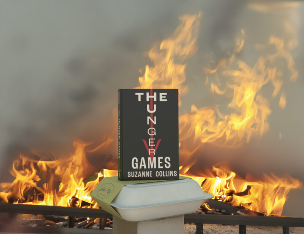
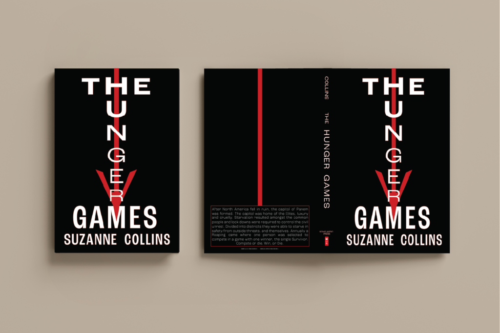
To reintroduce The Hunger Games for a new audience and re-engage loyal fans, I designed a striking book jacket that evokes the essence of Katniss Everdeen’s story without using imagery. Drawing on interviews with readers and analysis of past designs, I incorporated a symbolic arrow to capture the character’s spirit while fostering curiosity about the storyline. A bold color palette and serious tones highlight the story’s gravity, while the typography seamlessly blends the title and theme, pointing to author Suzanne Collins as the anchor. The design balances familiarity with fresh intrigue, enticing both new and returning readers to pick up the book. Deliverables included print-ready files, mock-ups for marketing, and digital assets for brand consistency.
Long Form Case study
THE HUNGER GAMES
Client and Project Background:
Still hungry
Design Brief:
(The Problem). Create a book jacket design for an upcoming republishing of a well known storyline and author. Create without images and support the theme and essence of the story while stirring intrigue
Research and Inspiration:
Compare the available literature and review the creative deliverables previously associated with the brand of the storyline. Interviews were conducted with readers and fans of the series and common word choices and visuals were drawn from the data and refined to a focal point of design. Understanding some of the key motivations of the target audience enabled choices for design selection.
Concept Development:
The title Hunger Games is known on its own but how do you catch the attention of new readers, read it again readers, and how will it stand out on the bookshelf or store display. The key was to create a design that brings in the suggestions of the story and associates it with the key Character of Katniss Everdeen whom is the key of recognition to the story line. The solution was the bow and arrow which is synonymous with the character. Incorporating the arrow into the design created the recognition and the colour themes were chosen to create a contrast and heavy serious feeling. Typography was incorporated to blend the title and theme together and it ultimately points to the author Suzanne Collins. The intent is get the consumer to pick up the book and discover more as now it is tactile in the hand. The arrow can represent many things and leveraging on the thoughts and curiosity created should point to reading and finding out the meaning the author intended.
Challenges:
The challenge was creating a sense of familiarity to those aware of the brand while enticing a new audience to approach the story with curiosity and expand readership.
Final Deliverables/Solution(s):
Book Jacket CMYK file and mach ups were provided for marketing and production. Digital slides were provided for brand utilization.
Conclusion:
Taking the existing brand and showcasing new designs refreshes the audience and allows for market retention and continued revenue from timeless work.
Leave a Reply