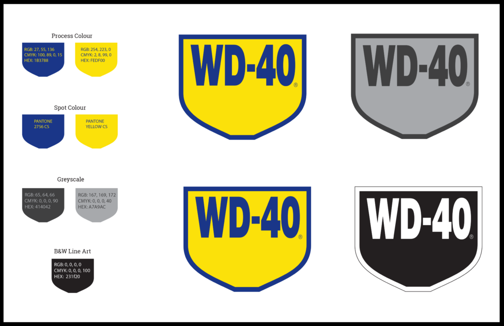
WD-40 has been a trusted essential in service environments for years, but its legacy is at risk in an increasingly competitive market. The product’s label often becomes obscured by grease, wear, and scratches, making it difficult for users to quickly identify, especially in fast-paced work settings. To address this, I reworked the logo for improved legibility and brand recognition. The font was adjusted to enhance clarity, and I increased the knockout space in the “D,” “4,” and “0” for better visibility. The new logo shape was designed to evoke a shield or badge, symbolizing protection and reliability. I also warmed the yellow to align more closely with industrial brands like CAT and De Walt, while ensuring the blue was standardized for international consistency. These thoughtful design changes are meant to refresh the brand, making WD-40 more visible, recognizable, and enduring in the hands of professionals now and in the future.
Long Form Case study
RE-DESIGN OF A LEGACY
Client and Project Background:
WD-40 has been a trusted service item for many years, known for its reliable performance in a wide range of environments. However, in a competitive and shrinking marketplace, its legacy is starting to dilute. As a longtime user, I’ve observed how difficult it can be for new and seasoned users to quickly identify the product due to smudges, scratches, and worn-out labeling on the can.
Design Brief:
(The Problem) The goal of this re-branding was to make the WD-40 product immediately recognizable and easy to identify in a live, industrial setting, even after being exposed to dirt, grease, and wear. The challenge was to preserve the iconic blue and yellow color scheme while improving legibility, ensuring that the logo remains clear even when covered in grease.
Research and Inspiration:
Having professionally used WD-40 for years, I wanted to enhance the brand without losing its essence. I focused on identifying the pain points users experience with the product, particularly in terms of label readability and brand recognition in demanding work environments. Interviews with fellow professionals revealed the importance of legibility and clear identification, which I kept at the forefront of the redesign process. I also drew inspiration from other industrial brands with similar yellow tones, such as CAT, De Walt, and John Deere, to target the right visual cues for the professional audience.
Concept Development:
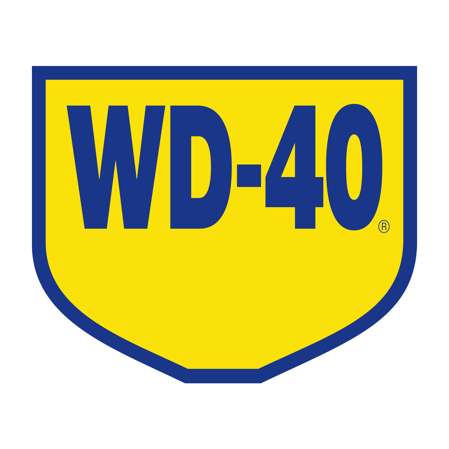
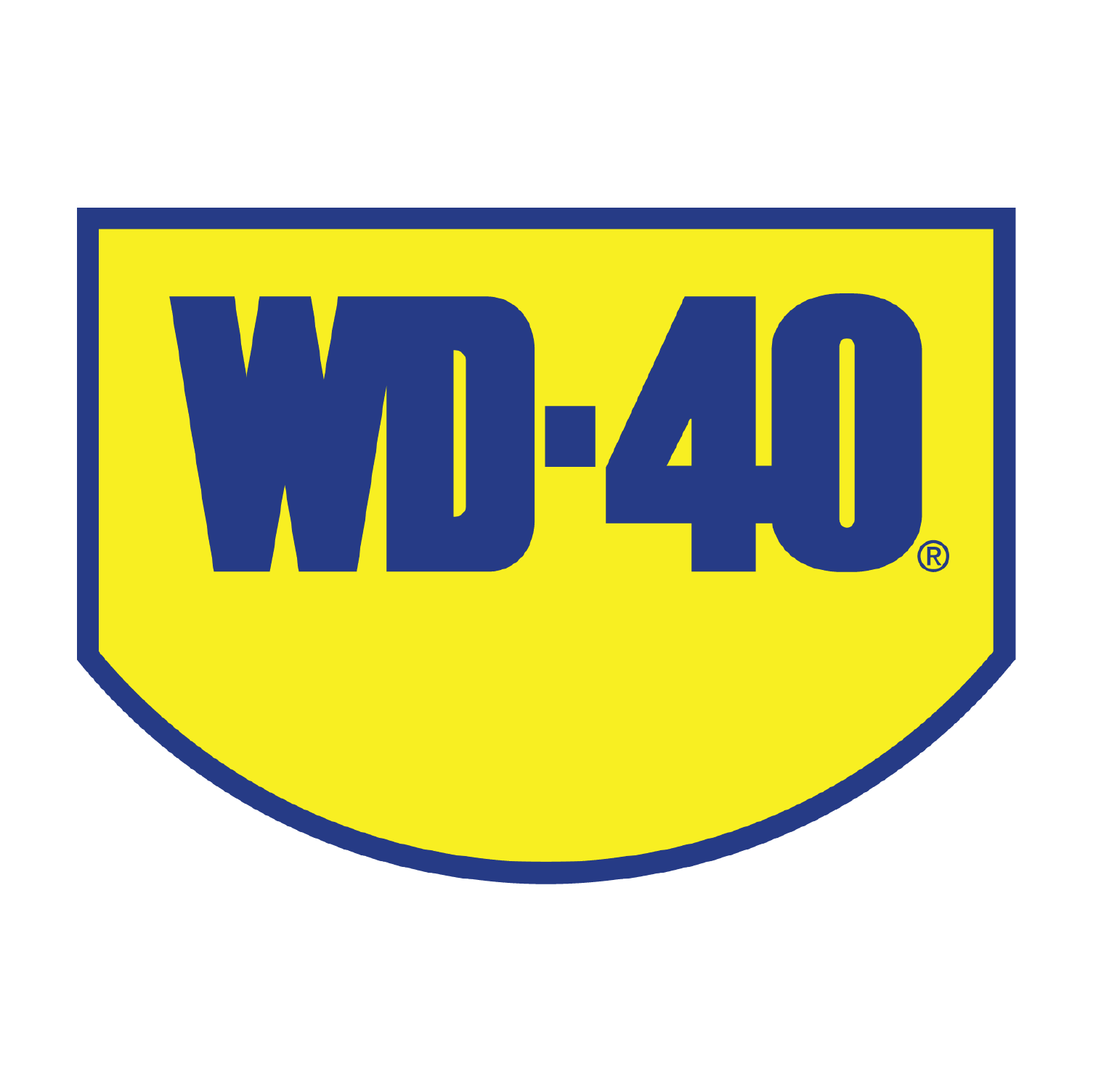
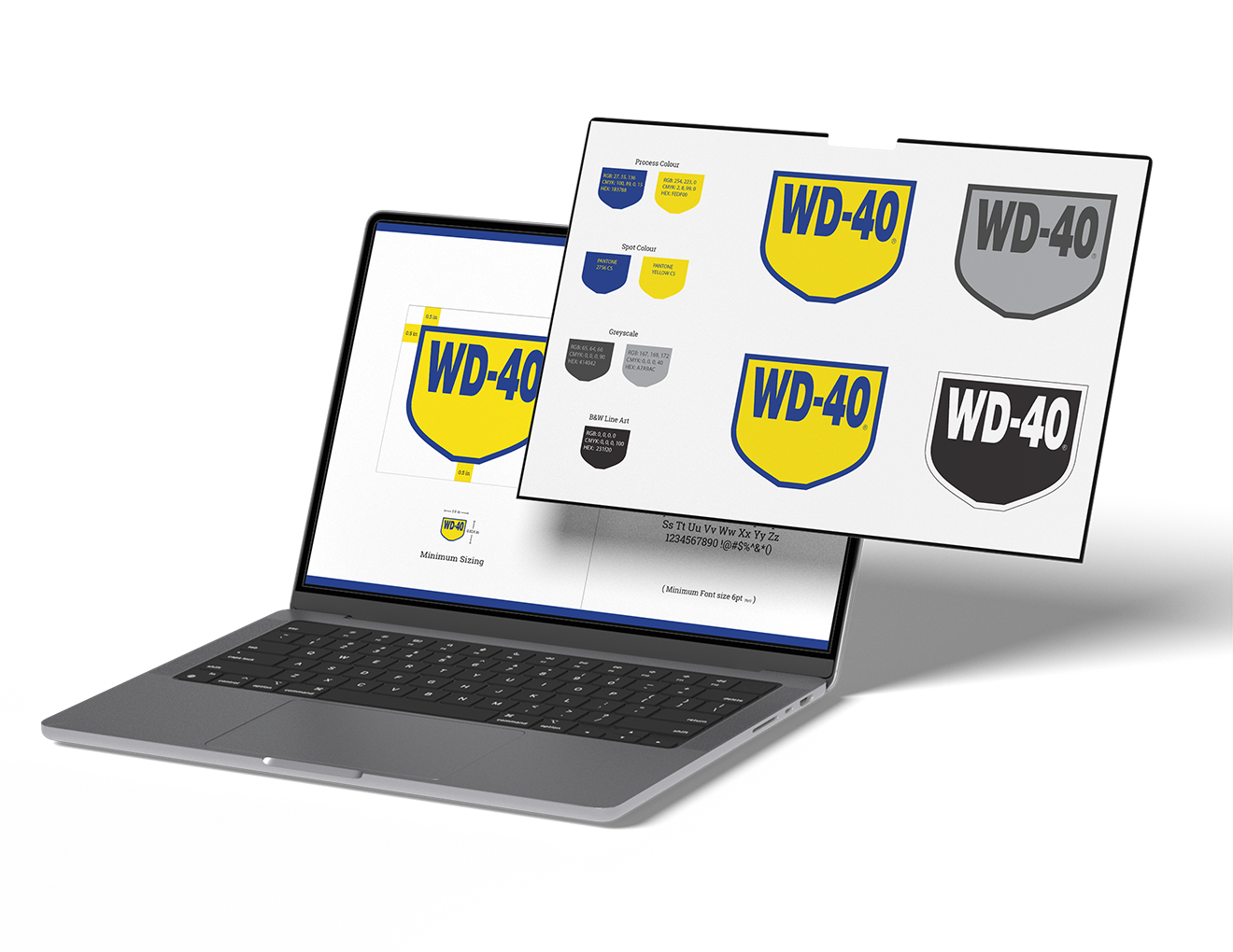
Font and Character Design: I increased the center knockout identity space in the “D,” “4,” and “0” of the WD-40 logo to improve legibility. I also adjusted the font shape to enhance the character recognition and to create a cleaner, bolder presence for the logo. This ensures better visibility in industrial environments where hands and tools may obscure the text.
Logo shape:
To reinforce the idea of protection and reliability, I reworked the logo to resemble a shield or badge. This update adds a new, modern key visual while preserving the overall structure. The revised shape represents service, protection, and the “bulletproof” nature of WD-40, further connecting it to its loyal user base.
Colour palette:
The iconic blue and yellow color scheme was preserved, but I shifted the yellow to a warmer tone. This adjustment serves three purposes: it enhances visibility, aligns with other prominent industrial brands, and adds a cautionary feel to the design. The blue was also adjusted to a more stable Pantone for international consistency.
Challenges:
The primary challenge was updating the brand’s visual identity to improve legibility and recognition while maintaining its established legacy. The re-branding needed to appeal to both seasoned professionals and new users while standing out in the cluttered competitive market.
Final Deliverables/Solution(s):
-Enhanced WD-40 Logo with improved legibility and updated font.
-New logo shape resembling a shield, symbolizing reliability and protection.
-Adjusted color palette with a warmer yellow and more stable Pantone blue for better recognition and international consistency.
-A refreshed, modern, and bold visual identity that maintains WD-40’s legacy while updating it for the next generation.
Conclusion:
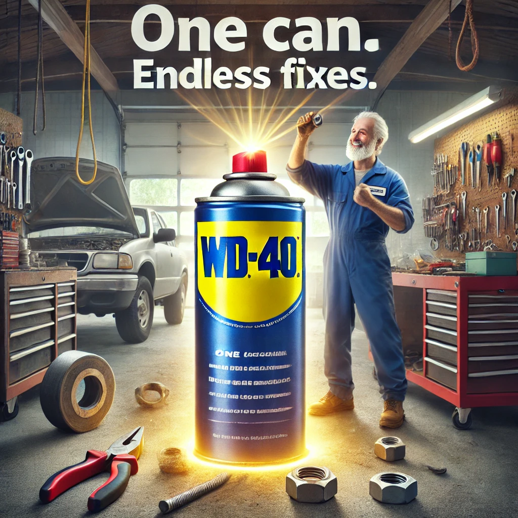
WD-40’s legacy of reliability and performance has stood the test of time. By enhancing its visual identity, we ensure the product’s recognition remains strong for future generations. These changes make the product more legible and visible in live, high-traffic environments, ensuring that WD-40 continues to be the trusted, “bulletproof” choice for service professionals. I hope these changes will ensure my grandson, like my grandfather before me, will continue to rely on WD-40 for years to come.
Leave a Reply